

Optimise Your Shop's Entrance: First 10 Feet Impact
In the competitive landscape of UK retail, every square foot of your shop matters. Yet, there\'s one area that holds disproportionate power, often dictating whether a customer stays, explores, and ultimately buys: the first 10 feet of your shop entrance. This critical zone, sometimes referred to as the "decompression zone," is where customers transition from the outside world into your retail environment. It\'s where the crucial first impression is formed, and it can make or break their entire shopping experience. For B2B wholesale buyers like yourselves, understanding and optimising this space is not just about aesthetics; it\'s a strategic imperative for maximising sales and fostering customer loyalty.
Understanding the Decompression Zone
The moment a customer steps through your doors, they enter a psychological transition phase. They\'re shedding the distractions of the street, adjusting to new lighting, sounds, and temperatures. During this "decompression zone" – typically the first 5 to 15 feet inside your shop – customers are unlikely to notice or engage with products. Their primary focus is on orienting themselves, assessing the overall atmosphere, and deciding if they feel comfortable enough to proceed further. Ignoring this natural human behaviour is a costly mistake many retailers make, often by placing their most exciting or high-margin products immediately inside the entrance, only for them to be overlooked.
Think of it as the retail equivalent of a welcome mat, but one that extends deeper into your space. It\'s not just about what they see, but what they feel. Is the entrance inviting? Is it clear where to go? Does it reflect your brand\'s promise? The answers to these questions are subconsciously processed within these crucial first few seconds and feet.

Key Principles for Optimising Your Shop Entrance
Clarity and Navigation
The primary goal of the decompression zone should be to provide a clear, unobstructed pathway into your shop. Customers should immediately understand the general layout and where they can begin their shopping journey. Avoid placing large displays or obstacles directly in their path, which can create a sense of being overwhelmed or blocked. A clear sightline deeper into the shop encourages exploration.
Visual Appeal and Atmosphere
This area sets the tone for the entire store. It needs to be visually appealing, clean, and well-lit. Consider the overall aesthetic – does it align with your brand and the products you sell? The colours, lighting, and general tidiness here contribute significantly to the customer\'s initial perception of your professionalism and attention to detail. A bright, inviting space feels more welcoming than a dimly lit or cluttered one.

Strategic Merchandising
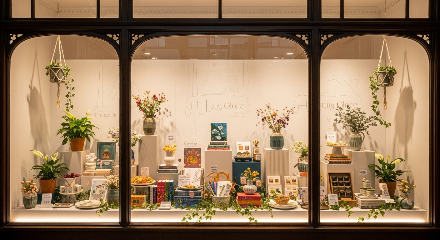
While customers aren\'t immediately ready to buy, this zone is perfect for "teasing" what\'s to come. Use it to highlight key categories or showcase new arrivals without being overly aggressive. This is an excellent spot for seasonal items or impulse purchases that are visually appealing and don't require much thought, such as small gifts or novelty items that catch the eye and gently guide them further inside.
Cleanliness and Maintenance
Perhaps the most fundamental, yet often overlooked, aspect. A dirty floor, dusty shelves, or unkempt displays in the entrance area immediately signal a lack of care. Ensure your entrance is immaculate at all times. This includes clean windows, well-maintained flooring, and regularly tidied displays. First impressions are indelible, and grime speaks volumes.
Sensory Experience
Beyond sight, consider sound and scent. A pleasant, subtle ambient scent can create a positive association, while appropriate background music can enhance the mood. Avoid overpowering fragrances or jarring sounds, which can have the opposite effect. The aim is to create a multi-sensory welcome that is subtle yet effective.
Practical Strategies for Layout and Merchandising
Clear Pathways and Flow
Ensure your main aisle is wide and unobstructed. Think about the natural flow of traffic – most customers tend to look left and move right (the "racetrack" effect). Design your entrance to accommodate this natural inclination. This might mean placing your initial, less critical displays to the left and drawing attention to the right.
Feature Displays and Power Walls
Once past the immediate decompression zone, typically around 10-15 feet in, you can start to introduce more impactful displays. A "power wall" or a prominent feature display can showcase your best-sellers, new product lines, or high-margin items. These should be visually striking and easy to interpret, offering a snapshot of your core offerings. For instance, a well-curated display of popular toys & games could immediately capture the attention of families.
Lighting as a Guide
Effective lighting can guide customers through your entrance. Use brighter lighting in the pathway and on key displays to draw the eye. Accent lighting can highlight specific products or architectural features, subtly directing customers deeper into your store. Avoid harsh, unflattering light that can make the space feel unwelcoming.
Signage and Pricing Clarity
While not for immediate hard-sell, clear, concise signage in the entrance area can help customers understand your store\'s sections or current promotions without feeling pressured. Ensure any displayed pricing is clear and easy to read, reinforcing trust and transparency. Overly complex or tiny price tags can be a deterrent.
Basket and Trolley Placement
Strategically place shopping baskets or trolleys just beyond the immediate entrance. If they are too far inside, customers might already be engaged and reluctant to backtrack. If they are right at the door, they can feel like an immediate commitment, which might deter browsers. Find the sweet spot where they are easily accessible but not intrusive.
Small, High-Value Impulse Items
Once customers have decompressed and started to move, small, affordable impulse items can be effective. These might include everyday household essentials, accessories, or popular pound lines. These items are often purchased without much deliberation and can add incremental sales. Ensure they are neatly presented and replenished frequently.
Creating a Lasting First Impression
Reflecting Brand Identity
Your shop entrance is a physical manifestation of your brand. Does it convey quality, value, fun, or luxury? Every element – from the colour palette to the materials used – should reinforce your brand message. Consistency builds trust and recognition. If your brand promises convenience, ensure the entrance is easy to navigate. If it promises premium quality, ensure the space feels elevated.
Customer Service Readiness
While not a physical layout element, the presence and readiness of your staff near the entrance are crucial. A friendly greeting, a visible staff member, or a clear indication of where to find assistance can significantly enhance the welcome. Staff should be trained to allow customers to decompress before offering assistance, but to be readily available and approachable.
Regular Refresh and Seasonal Updates
The entrance area should never look stagnant. Regularly update displays, especially with seasonal items, new product launches, or clearance offers. This keeps the space fresh and gives returning customers something new to discover, encouraging repeat visits. A dynamic entrance tells customers that your shop is vibrant and constantly evolving.
Beyond the Visual: Sound and Scent
Reiterating the sensory aspect, consider how sound and scent contribute. Is the ambient music too loud or too quiet? Does it match the demographic and product offering? Are there any unpleasant odours, or can you introduce a subtle, pleasant aroma that aligns with your brand? These non-visual cues can profoundly impact a customer\'s mood and their perception of your store.
Common Pitfalls to Avoid
- Clutter: Overloading the entrance with too many products or displays creates visual noise and can overwhelm customers.
- Poor Lighting: Dim, uneven, or harsh lighting makes the space uninviting and can obscure products.
- Lack of Clear Direction: Customers should instinctively know where to go. A confusing layout leads to frustration and early exits.
- Overwhelming Displays: While feature displays are good, avoid making them too dense or complex right at the entrance. Keep it simple and inviting.
- Neglecting Maintenance: Dirty floors, smudged windows, or dusty displays are immediate turn-offs. Regular, meticulous cleaning is non-negotiable.
Measuring Success in Your Decompression Zone
Optimising your shop entrance isn\'t a one-time task; it\'s an ongoing process that benefits from data-driven insights. Here\'s how you can measure its effectiveness:
- Footfall vs. Conversion: Track how many people enter your shop versus how many make a purchase. An improved entrance should lead to a higher conversion rate as more customers feel comfortable exploring.
- Dwell Time: Observe how long customers spend in the initial 10-15 feet. If they\'re rushing through, it might indicate discomfort or a lack of engaging elements.
- Sales Data for Entrance-Zone Products: Monitor the sales performance of products strategically placed in or just beyond the decompression zone. Are your impulse buys flying off the shelves? This is a direct indicator of effective merchandising in this area. For example, a strong showing for health & beauty travel-sized items near the entrance could suggest effective placement.
- Customer Feedback: Directly ask customers about their initial impressions. Surveys or informal conversations can provide invaluable qualitative data.
- Observation: Dedicate time to simply observe customer behaviour upon entry. Where do their eyes go? Do they pause? Do they seem confused? This hands-on approach can reveal immediate areas for improvement.
Conclusion
The first 10 feet of your shop entrance are far more than just a doorway; they are your most powerful marketing tool, your silent greeter, and the initial architect of your customer\'s journey. By thoughtfully designing and meticulously maintaining this critical space, you can transform it from a mere entry point into a compelling invitation. A well-optimised entrance not only enhances the customer experience but directly translates into improved footfall, increased dwell time, and ultimately, higher sales. Invest in your entrance, and watch your business thrive.
For a comprehensive range of wholesale products to stock your strategically optimised entrance and beyond, visit Rysons.com today and discover how we can help you make every foot of your retail space count.